
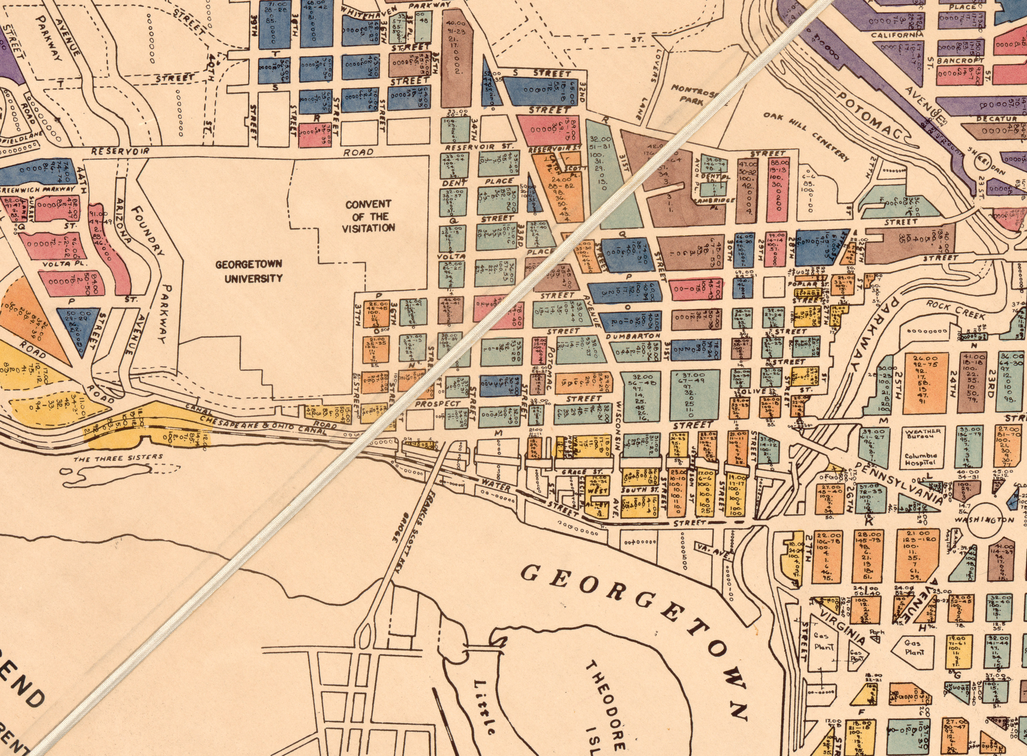
This week, the website DC Urban Turf dug up a wonderful map from the Library of Congress that shows the prevailing rents for each block in the city as of 1937. GM wanted to focus on what this map says specifically about Georgetown, and how much more affordable of an neighborhood it was then.
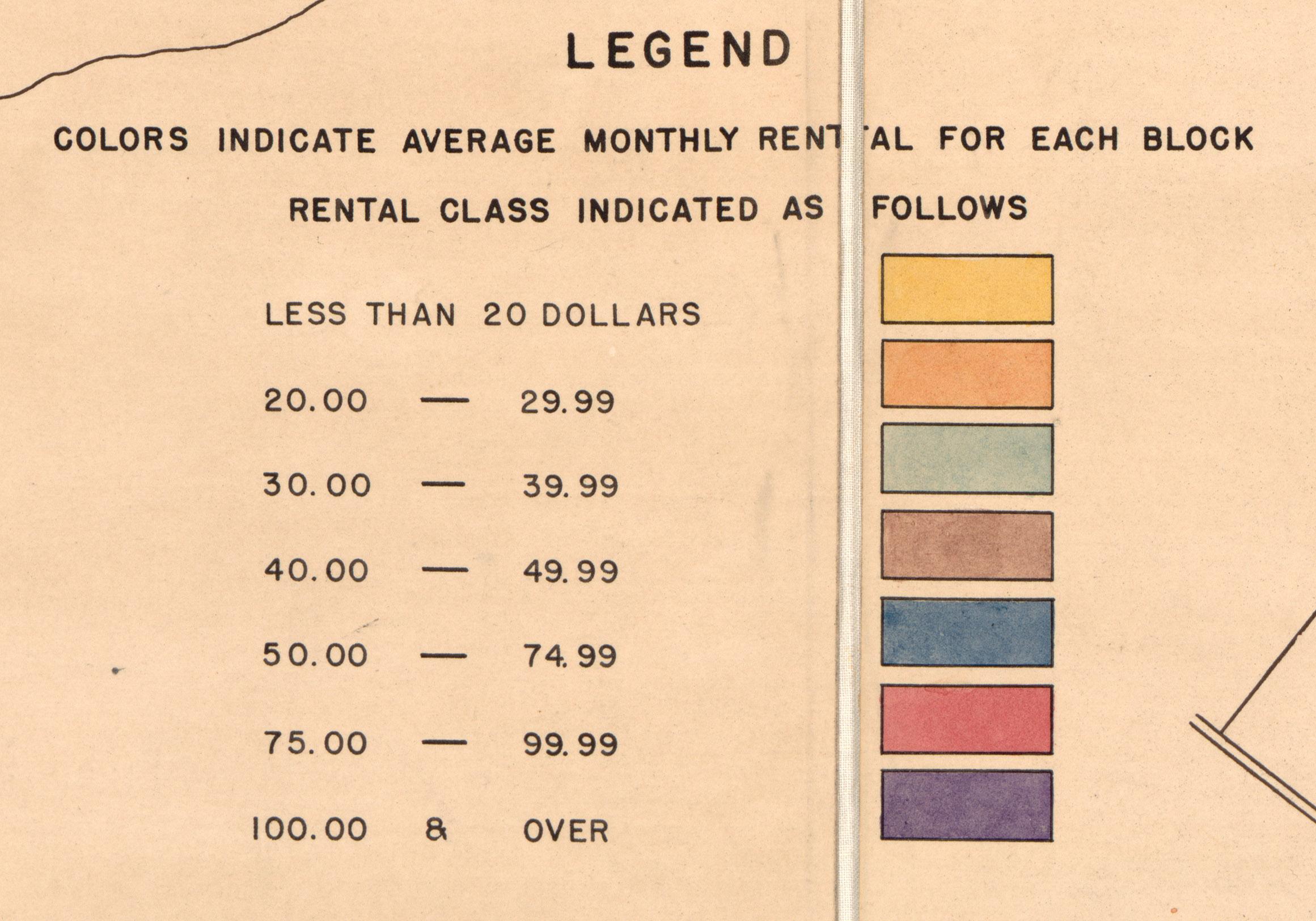
The selection above shows Georgetown. This is the legend for the colors:

Of course these numbers are 1937 era costs. To relate to our present day you need to adjust the prices for inflation. This is what the consumer price index inflation calculation produces for the colors:
- Yellow: Less than $356
- Orange: $356 – $517
- Green: $517 – $695
- Brown: $695 – $873
- Blue: $873 – $1336
- Red: $1336 – $ 1764
- Purple: Over $1764
As you can see from the map, large swaths of Georgetown were Orange, Green, and Brown, suggesting rents in today’s dollars of $356 – $873. That would be a pretty good price!
But inflation calculators can sometimes be deceiving, particularly for real estate. And the fact that the top color starts at $1764 (which is not exactly a premium rent by today’s standards) suggests that the adjusted numbers aren’t quite right. Continue reading →

 Photo by Kent MacElwee.


You must be logged in to post a comment.