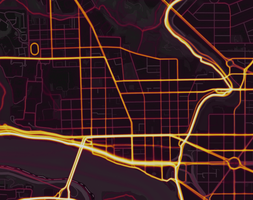
As you may have read how it unveiled secret bases around the world, the exercise tracking app, Strava, has released a world map showing the aggregate data of all its users. Essentially, they took the millions of routes its thousands of customers tracked and put it out for the public to review. So we can zoom into a place, like Georgetown, and see how Strava users get through the neighborhood.
(First a quick caveat: obviously not all people running or biking through Georgetown use this app. It tends to be slightly more hard-core runners or cyclists who use it.)
The app keeps track of what sport you’re participating in. The heat maps focus on just four of the most popular: running, biking, water sports, and skiing. And the heat map lets you select all or each of these activities. The map above is for all the activities. The individual maps for running and cycling don’t vary that much, but they aren’t identical. Continue reading →

 Photo by Mrs. Gemstone.


You must be logged in to post a comment.