

It’s a great time to sell a house in Georgetown. And three charts can explain why.
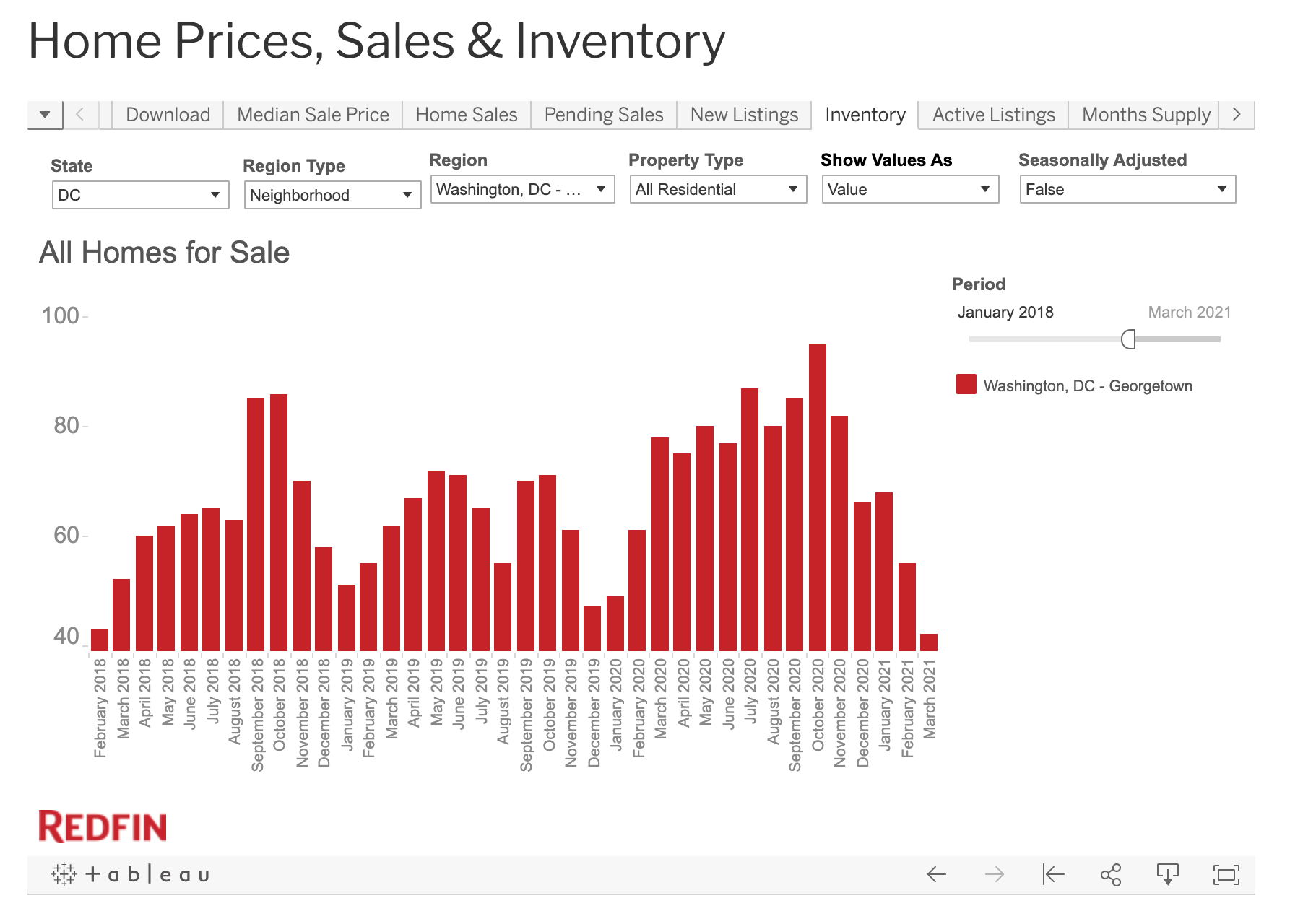
The first chart is a chart of the inventory of homes for sale in Georgetown since January 2018. As you can see, the inventory of homes for sale were on the higher side through most of 2020. But after dropping during the normal winter lull, the homes just never came back. In March 2020, there were 78 homes for sale in Georgetown. This March it was 42.
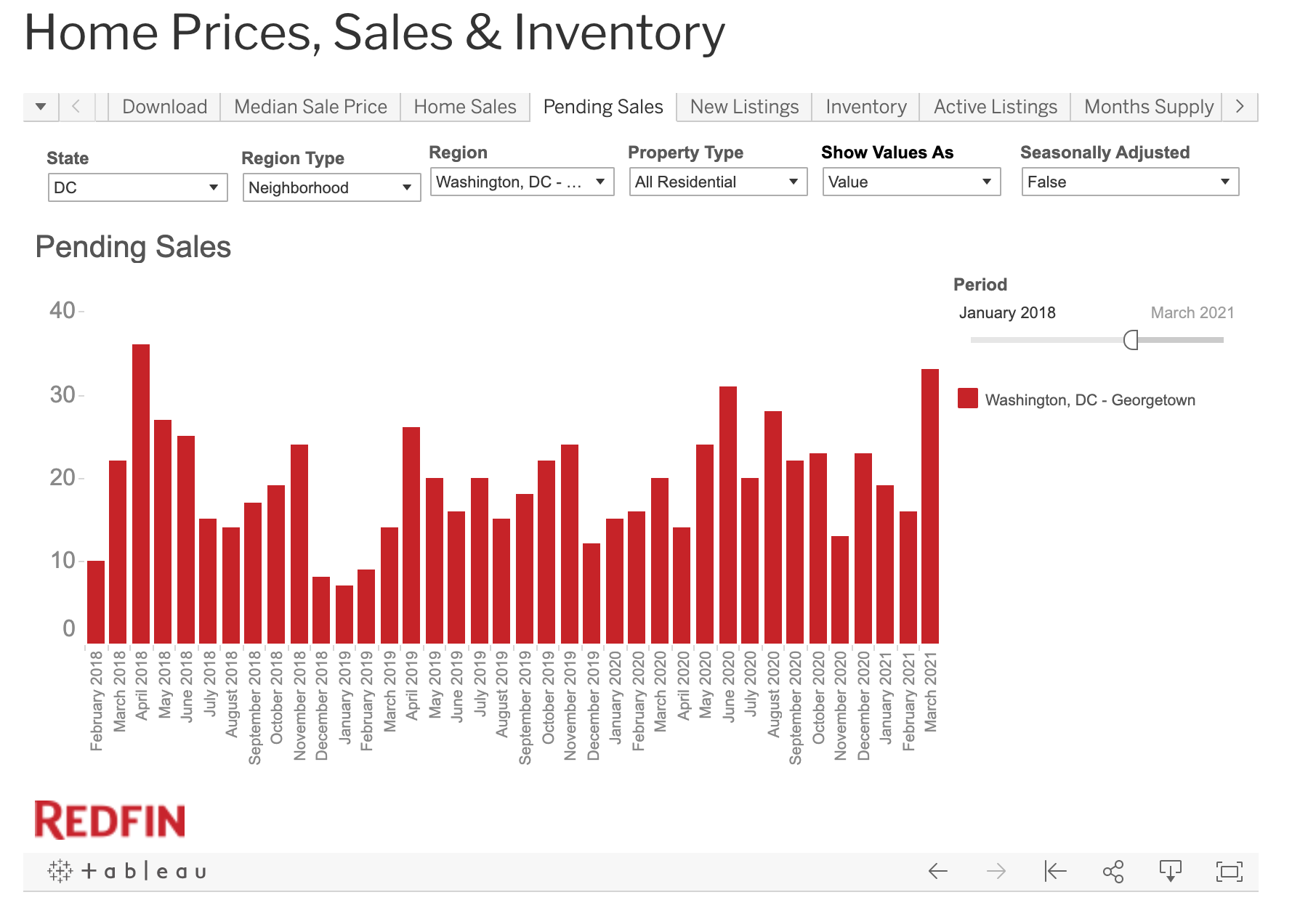
The second chart tracks the number of home sales in Georgetown. And despite there being so few homes for sale this spring, there were more homes going under contract this March than since April 2018. The buyers simply cleaned out the shelves.
In short, if you think you might want to sell your house in Georgetown in the next year or so, you probably ought to consider moving up those plans. GM knows of at least one neighbor who did just that. They listed the home at a price GM thought was a bit of a reach and yet it went under contract in two days.
Time will tell how long this situation lasts…


‘Benefit’ is a strong word.
Property taxes go up, buyers pay more, prices are high & inventory tight everywhere so sellers don’t gain anything unless they move to Oklahoma, or a tent under the bridge..